Work
National Brain Tumor Society

Crafting a brand to support the brain tumor community

Brands
Health

National Brain Tumor Society (NBTS) knew that a more cohesive, unified brand presence would serve as a powerful tool to bolster their communications and signal their strength as they strive for a world without brain tumors. Big Duck developed an inspiring new brand for NBTS to connect all areas of their work, raise the organization’s visibility in the brain tumor community, and increase engagement.

Collaborating through each evolution

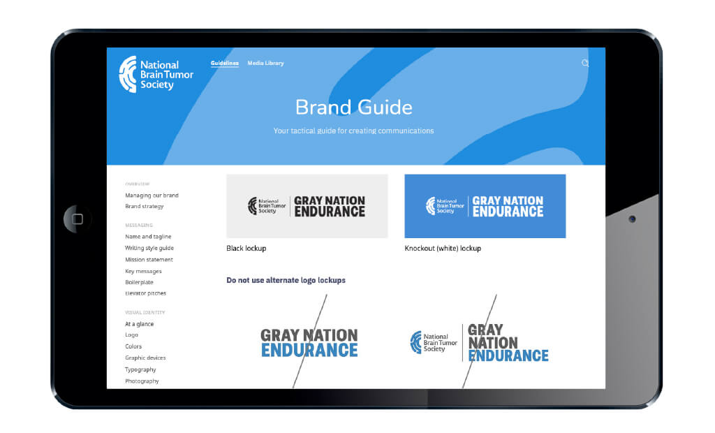
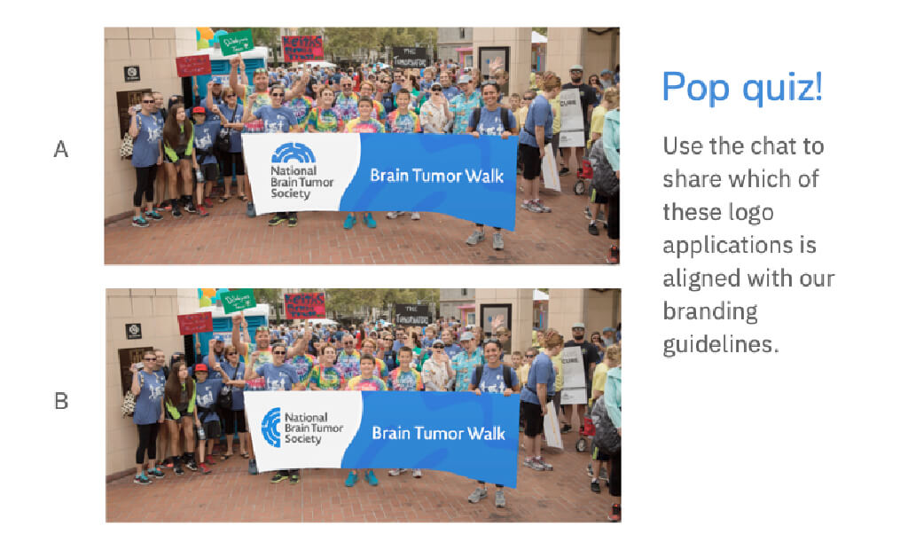
The Big Duck team was excited to create NBTS’s new brand identity, especially because we have collaborated before: we first partnered with NBTS as they began a new chapter in their own story following the merger of two organizations. At the time, Big Duck worked with NBTS to create a tri-color brand that spoke to the strengths of each founding entity. Fast forward twelve years, and NBTS has continued to evolve into a leading force in the brain tumor community and was ready for a more streamlined and singular brand identity to promote and rally around. Big Duck brought this chapter of the organization to life by crafting a comprehensive rebrand that included a new logo and tagline, solutions and guidelines for their sub-brands, an online brand hub, templates, staff trainings, web consulting, and more.

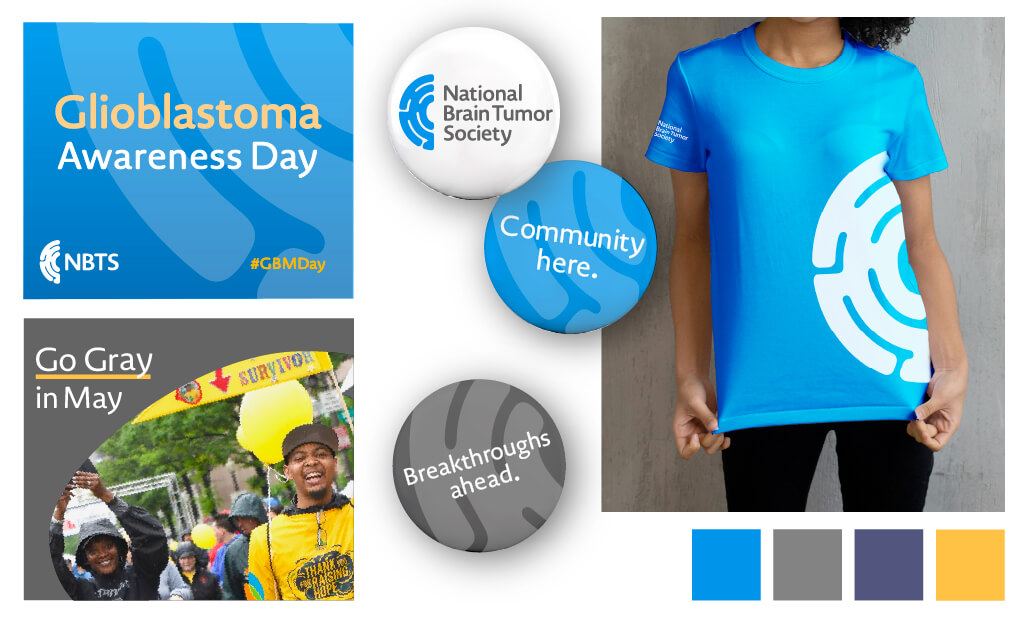
Colors that inspire and unite

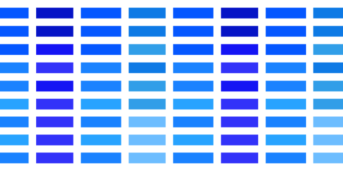
Gray is the color of the human brain, and it is used to connect all organizations fighting brain tumors. However, as a color, gray lacks the passion, vibrance, and commitment to a brighter future that the NBTS community embodies. Big Duck built a brand that centers on a vibrant and optimistic blue — paired with the gray of the movement — to both differentiate and link them to the international community.

NBTS’ new logomark printed on a banner at an event
We crafted brand architecture solutions for their sub-brands then included them in their online brand hub.
NBTS’ brand guide which encompasses all of the do’s and don’ts of applying their brand
Our work together included brand trainings to help staff fully embrace the new brand.
Examples of NBTS’s new colors, tagline, logomark, and fonts in use across branded swag and social media posts.
Snapshot view of NBTS’s new brand and toolkit, including their tagline “Community here. Breakthroughs ahead.”

Results

Poised for progress

With their new rebrand, NBTS amplifies their leadership in the space and grows awareness of their programs and initiatives, advancing their mission to bring together the best of research, advocacy, and patient services for the brain tumor community.

78%

increase in engagements across existing social media platforms and new communities on TikTok and Threads

30%

increase in newsletter subscriptions from 2022 to 2023

Big Duck understands our origins, our mission, and all the work that goes on behind the scenes. They created a brand that reflects the core elements of who we are, and the passion of our staff and community as we aim to conquer and cure brain tumors–once and for all.

— Katie Germain, Chief Marketing and Communications Officer

A symbol of hope and realism

NBTS’s iconic new logomark abstracts a hemisphere of the brain, evoking both positive associations (a rainbow, an embrace, and a smile) while also speaking to the labyrinth that is the treatment journey and research process. Big Duck also developed a simple and pragmatic approach for their sub-brands’ visual identities to make them easier to manage internally and build greater awareness for NBTS.