Work
Keys to Change

Creating clarity about vital community services

Brands
Family and community
Health
Social justice

The Human Services Campus has provided crucial support to the Phoenix community for decades, but there was confusion about the role they play as a strategic partner working to end homelessness and their presence as a physical space for services. While their mission remains unchanged, Big Duck developed a clear, connected brand for their two related entities — Keys to Change and Key Campus — reflecting the energy and ambition of their goals, and forging stronger relationships with audiences.

Connecting the community with compassion and care

Big Duck and Keys to Change collaborated to develop brand strategy, new naming systems, taglines, and visual identities that reflect both the foundational ideas of the organization and its ambitious goals — creating systemic changes with a focus on prevention, keeping people in their homes, diverting individuals from the homelessness system, and advocating for more affordable housing. Their new brand assets reflect their belief in the power of collaboration to create solutions to end homelessness.

Remaining true to their roots

It was important to honor the history and values of Keys to Change when developing the next generation of their brand. Both new names and taglines emphasize the work being “key” to solving the larger problem and its connection to housing, as well as reinforce a phrase frequently used by their founder: “the way home.”

Leadership and collaboration

Keys to Change is now able to leverage the clarity of its new, distinct identity to tell the story of how they address homelessness from many different angles that don’t align neatly with Campus services.
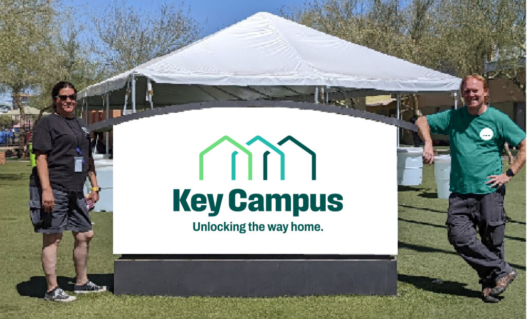
A sign with the campus identity in-between two people who are facing the camera
The new campus name, logo, and tagline shown on a sign.
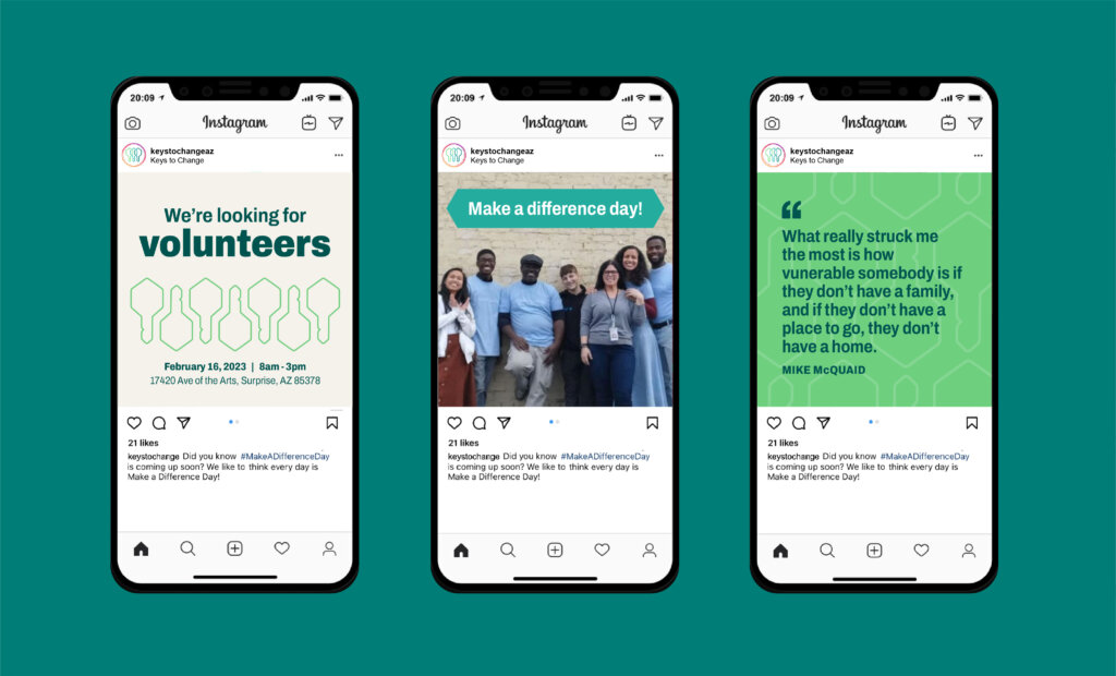
A series of four smartphone screens, each showing a different social media post design for the organization
The color palette and symbol are displayed on sample social media posts.
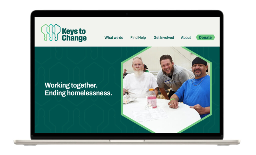
A laptop featuring a webpage with the logo for Keys to Change, a green background, a photo of three individuals smiling at a table, and the tagline “Working together. Ending homelessness.”
The primary organization’s new name, logo, and tagline shown on a refreshed website homepage.

Results

Keys to Change’s new identity and structure better express who they are and what they believe in, making it easier for the community to recognize and connect with them. With greater awareness and understanding, they’re better equipped to advance efforts that end homelessness and overcome systemic barriers

We needed a true partner and collaborator to think through the ways our identity and communications could support our efforts toward strategic growth and service in the community. Big Duck was that partner, driving an organizational rebrand that will allow us to think and aim bigger while continuing the core, everyday work for which we’re known and relied upon.

— Amy Schwabenlender, CEO

Clarity through consistency

Big Duck created an easy-to-update digital brand guide with key sections on brand architecture, strategy, visuals, templates, and more. The guide is available through an online portal to improve accessibility and adoption and stores all the core elements in one place to help keep the brand consistent.