Using sub-brands strategically

Here at Big Duck, we generally advocate for a less-is-more approach to brand architecture—the strategy for organizing and expressing the relationships of your brand—to make it easier for supporters to see the connection between you and your initiatives. Tying your sub-brands (unique brands for your programs, projects, events, and initiatives) to your primary brand can help your audiences transfer a narrow band of support to your organization as a whole, which helps them to make deeper connections to advance your mission.
Branding is a tool to build relationships, so it is important to understand the audiences you are in a relationship with. After mapping out a ladder of engagement and uncovering programs within your organization that need to reach an audience group distinct from your priority audiences, you may be thinking about how to communicate in distinct ways to draw attention to a special initiative or to work around an association that could cause barriers or confusion. This is where thoughtfully considered, differentiated sub-brands come in.
Sub-brands can be a powerful communications tool, as long as you are intentional that they won’t take attention away from your primary brand. When and how differentiated will be questions you’ll need to ask yourself in every situation. So, below you’ll find some examples of occasions and ways to establish unique sub-brands. (Note that Big Duck did not work on all examples shown below.)
Legally distinct
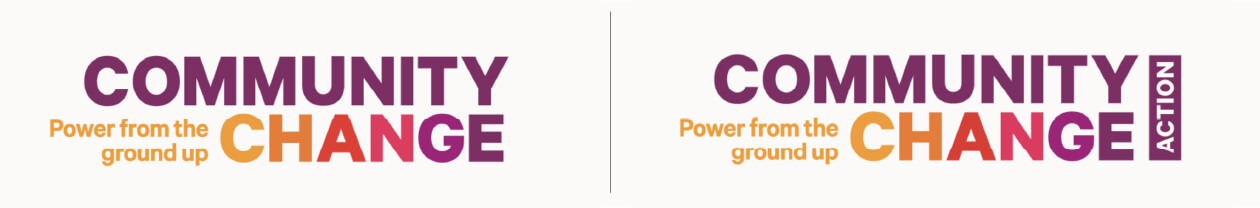
During a rebranding process, Big Duck determined that Community Change, a 501(c)(3), and its sister organization, Community Change Action, 501(c)(4), would benefit from a more unified branding approach.
What to keep the same or make different?
- The two logos are aligned, differentiated only by the “Action” tag
- Both organizations share the same tagline and other messaging elements
- We developed a common system of colors, typography, and graphic elements, making it simple and easy to create materials for one or both organization
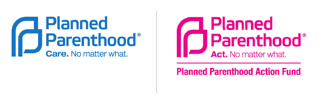
Planned Parenthood Federation of America and Planned Parenthood Action Fund are two well-known organizations with very different (healthcare vs. advocacy) focus areas and legal structures, but intrinsically overlapping missions.
What to keep the same or make different?
- The two organizations share the same logo symbol and wordmark but are distinctly separated by color
- Each organization has a tagline that follows a common structure (Care. No matter what. / Act. No matter what.)
- The advocacy organization has an additional line to clarify its full legal name (Planned Parenthood Action Fund)
- The two organizations share typefaces, website design, and some other supporting elements, but differentiate themselves in tone with Action using much bolder treatments and Care utilizing a more comforting look and feel
Location, location, location
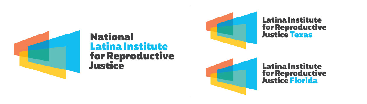
The National Latina Institute for Reproductive Justice works at both national and state-based levels. During our branding work, Big Duck developed a system that enables state-based networks to identify themselves, while maintaining a close affiliation with the primary brand.
What to keep the same or make different?
- State-based chapters have a slight shift in their naming structure—instead of National at the beginning of the names, the state appears at the end
- While the shortened name Latina Institute is highlighted in the national logo, the network logos call out the state names
- Beyond logos, we developed a common system of colors, typography, and graphic elements, making it simple and easy to create materials that can be used by all
When an organization has multiple locations, it may be important to clarify that in branding. The world-renowned MoMA in Manhattan and MoMA PS1, its contemporary art center in Queens, are tightly connected brands.
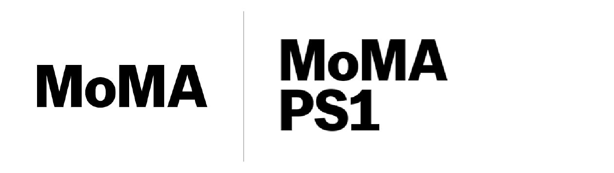
What to keep the same or make different?
- PS1 builds off the main MoMA logo and brand by attaching its unique name (PS1), in letters of equal size and style
- Beyond the logo, the two locations share a website, messaging tone, and all other visual identity elements
Media matters
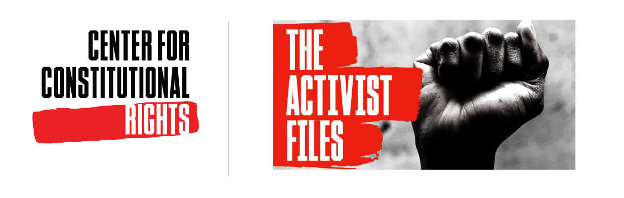
Many organizations produce unique content, which is often hosted by an external platform (e.g. YouTube, iTunes, or Spotify). While rebranding The Center for Constitutional Rights, Big Duck identified a need for their podcast, The Activist Files, to have a unique solution, but still be linked to the organization behind it.
What to keep the same or make different?
- The podcast has a unique name that helps describe it
- In messaging, the podcast clearly defines its relationship to its organization: “The Activist Files is a podcast by the Center for Constitutional Rights where we feature the stories of people on the front lines fighting for social justice, including activists, lawyers, and storytellers.”
- The podcast has a unique visual treatment, but one that is very closely linked to the larger organizational brand, using shared fonts, colors, and graphic elements from the brand system
- The organizational identity is featured as the author
Events and campaigns are special
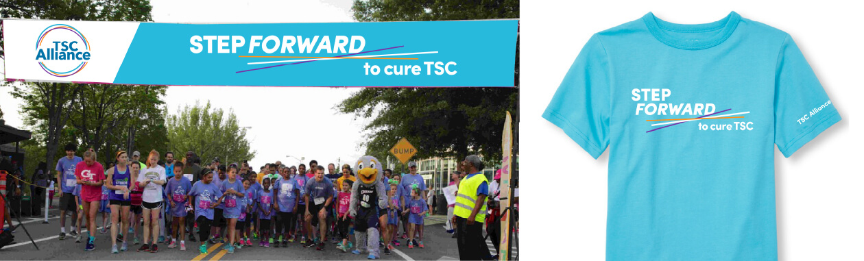
After establishing a new organizational brand for TSC Alliance, we worked together to think about how they could give unique emphasis to one of their key events—a walk with pre-existing name recognition, Step Forward to Cure TSC.
What to keep the same or make different?
- While the event has a unique name, Big Duck made sure there would be a clear link to the organizational brand by utilizing its colors, fonts, and graphic elements
- In brand guidelines, we established rules to ensure the presence of the organizational logo in all iterations of event collateral
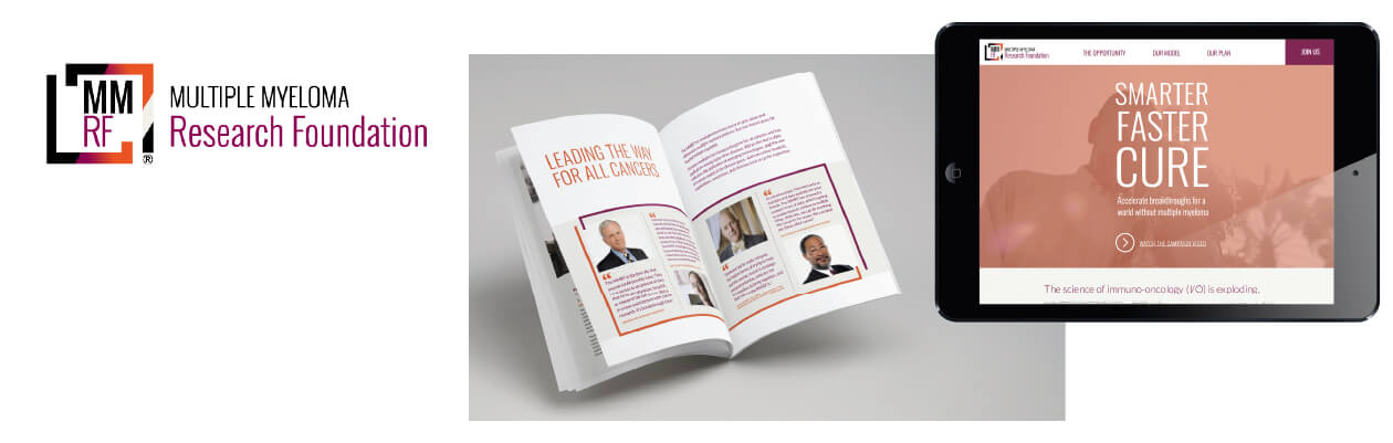
When the Multiple Myeloma Research Foundation (MMRF) needed materials to start facilitating conversations with prospective donors to a $100 million fundraising campaign, Big Duck helped to develop a campaign identity and materials that felt familiar to those supporters and had a unique flair to get noticed and make clear that this was a very special initiative.
What to keep the same or make different?
- The campaign has a unique name (Smarter, Faster, Cure) and visual treatment, which functions like a headline, rather than a separate logo
- We repurposed elements from the existing visual brand, such as colors, fonts, textures, and the bracket element from their logo
- The campaign was presented online via a microsite with clear links back to the main organizational site
Starting fresh
In rare cases, it may be necessary to break all branding ties and start afresh. Big Duck conducted research and developed a brand architecture strategy for the New York City Campaign Finance Board for its voter education initiative. We recommended a disconnected consumer-facing brand that would resonate with the diverse and wide population of NYC voters.
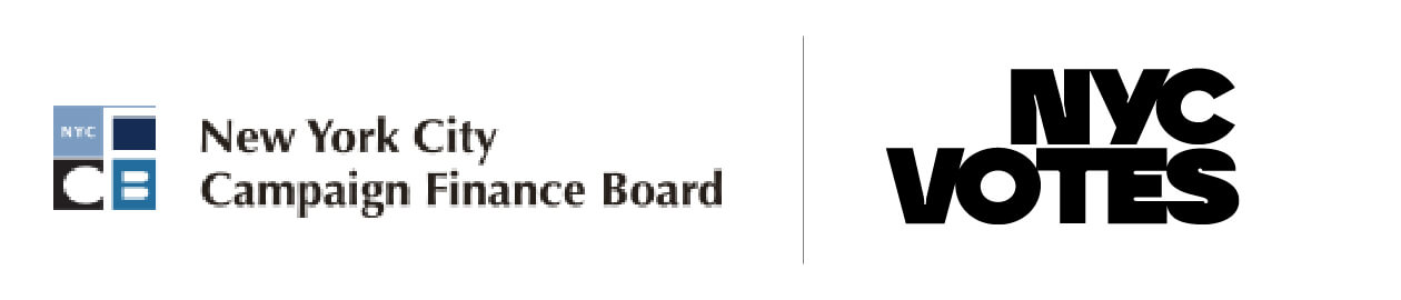
What to keep the same or make different?
- The new initiative got its own name (NYC Votes) and entirely new visual identity system (designed by Pentagram)
- The two entities maintain separate websites, with very unique goals, but are explicitly linked with the following messaging: NYC Votes is an initiative of the New York City Campaign Finance Board, the independent city agency that ensures local elections are fair, inclusive, and open.
Applying this to your organization
While these examples make it clear that it can be necessary, clarifying, or inspiring to develop a sub-brand for your nonprofit, it’s an important decision that should be made with caution and intention. If your organization already has a plethora of sub-brands, here’s a simple way to assess the current brand architecture situation at your nonprofit before making more.
You can also contact us if you are looking for a partner to conduct an audit of your sub-brands, develop an intentional approach to how you connect sub-brands to your primary brands, create new names and/or visual solutions, or need other