Can’t rebrand? Try these 5 easy ways to brand refresh instead.


Does your brand feel dull? Do you feel excited when you look at your color palette and photos? And, when you look at peer organizations, do you feel like their visual expression is miles ahead of you? Has your strategy as an organization evolved to where your brand expression feels way out of sync? If you answered yes to any of those questions, but you don’t have the time or money to rebrand, it might be time for a brand refresh.
A brand refresh can help revitalize the look and tone of your brand without making any major changes to your overall brand identity. By focusing on specific challenges or opportunities, like a logo that doesn’t scale well or a low-quality imagery, you can transform your brand visuals to better align with your strategy and connect with your audiences. Below, we break down five visual shifts that can breathe new life into a stagnant or outdated brand.
Refinement 1: Explore fonts that elevate your voice
Fonts tell a bigger story than you might think. Your typeface is one of the first design elements your audience encounters. The fonts you use tell your story, share information, highlight important milestones, and communicate your organization’s tone and style. Think confidence, seriousness, sophistication, warmness — fonts convey all of these emotions and build perceptions as they interact with other elements in your visual brand. For these reasons, changing your typeface is a small tweak that can have a big impact when it’s time to refresh your brand identity.
But, how do you choose the right font?
Ask yourself: Are your fonts out of style? Are they hard to read and pose barriers for some audiences? Do your fonts reflect your personality? Is your font overused by your peers? Do you even like your existing fonts?
To start. focus on the larger type you use for headlines, also known as “display type” to reinvigorate your brand identity. Examine your brand strategy, which includes your personality, positioning, and values. Choose a new font that is unique, and aligns with your strategy to reinforce your identity, communicate your brand’s mission, and, in turn, set you apart. Avoid choosing too many fonts, as that can make your materials look messy. Instead, opt for one font for headlines and one font for your body copy to keep your materials look clean and consistent.
One option is a shift in case, moving away from all upper-case text to lower-case to change your tone and convey a more friendly and approachable personality. Or, play with a bolder weight for your headlines to create hierarchy and an accent across your materials and better organize paragraphs of content. Make sure your new fonts are versatile, adaptable across your website, social media, and print, and legible in all sizes!

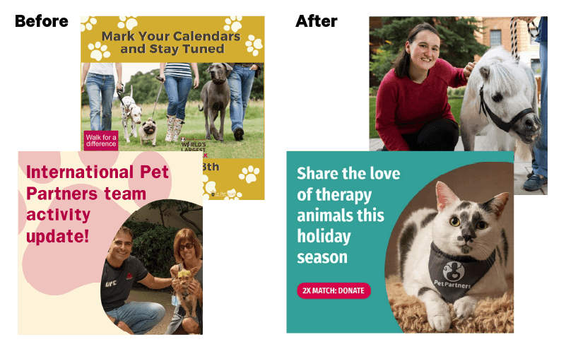
Refinement 2: Select images that paint a picture
Photos create a compelling brand identity because they tell a story before your audience even reads a word. As a result, photography makes meaningful connections with your audiences. Additionally, photos can differentiate you from your peers and call attention to your brand. So, in a crowded space, having fresh visual content is a simple way to give your organization a makeover and look more modern, polished, and engaging.
How should you choose images?
If you update the photo you are using prominently, capture a visual style that is true to your brand personality, your work, and your audiences. For example, if your brand personality is fun and friendly, pick photos that use bright colors and give off a positive vibe to reinforce your brand identity and resonate with your audiences.
As you curate new images, look for a consistent quality and style so that your photos come together to paint a clear story of who you are. Take time to optimize your photos across all platforms and devices, for example if you’re selecting images for social media, double check the platform’s size recommendations so that you can reformat your images and ensure they are clear and properly cropped. Optimizing imagery helps you elevate your content strategy and build a brand style that is unique to you.
Lastly, after you have established your new visual style, try being more thoughtful and keep equity and inclusion in mind when sourcing images — meaning photos you use are not reinforcing systems of oppression or causing harm — this way you are effectively communicating your brand identity but also accurately representing the groups you work with.
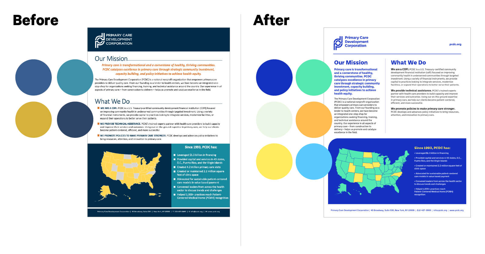
Refinement 3: Find a palette that speaks to you
If your brand is feeling dated or stagnant, changing your color palette can spice things up. To choose new colors, consider whether your existing palette fits the message you are trying to communicate. Colors have the power to evoke emotions; for example, blue can be associated with trust or responsibility, yellow with friendliness, and red with boldness. Because of this, colors communicate your personality at first glance — whether that be nostalgic, professional, edgy, or vibrant.
How should you get started with colors?
Explore the feelings you want associated with your organization, and then pick colors that will build those perceptions. You can also look at your peers and see what colors are used in your space — do they signify something specific? Sometimes, emulating the colors in your space can help audiences easily identify your cause. For example, if you are a conservation organization, green immediately gets the message across. But, even if your primary brand color has equity and you shouldn’t make a change, you can still experiment with a pop of color that is unique to you and adds a bit more life to your brand. Similarly, if you are currently working with a limited color palette, adding a new color is the perfect way to explore accent colors across your materials. Color and its consistent use does a lot for brand recognition, so choose a color scheme and stick to it. However, no matter what colors you choose, consider color accessibility and make sure your colors have enough contrast so your materials are legible.
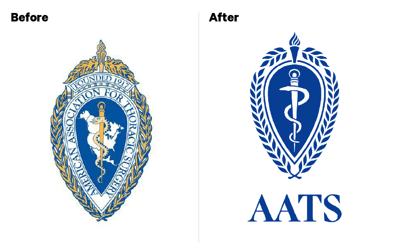
Refinement 4: Bring your logo to this century
One of the most common ways to refresh—and strengthen—your brand is to update and modernize your logo. However, they are also typically the most recognizable aspect of your brand so when tweaking your logo, align any changes with your brand strategy goals. Updating your logo can mean simplifying it by removing any unnecessary or outdated elements like excessive text, complicated graphics, or too many colors. Simple changes like adjustments to proportions, spacing, or orientation, can go a long way and help your logo become more adaptable across all media, especially in small spaces like on social media. Making your logo clearer and more concise will also help it become much more memorable.
But, how do you decide what to keep and what to change?
If you update your logo, don’t lose the spirit of your brand. You want to refresh your logo but also honor your legacy. Consider what aspects of your logo audiences associate with you and have brand equity, like a primary brand color or a key symbol, and retain those key elements so audiences continue to recognize and connect with your organization. At the end of the day, refining your logo is meant to elevate your brand, your personality, and the ideas you want audiences to associate with, so refresh this critical part of your visual identity while also respecting your past.
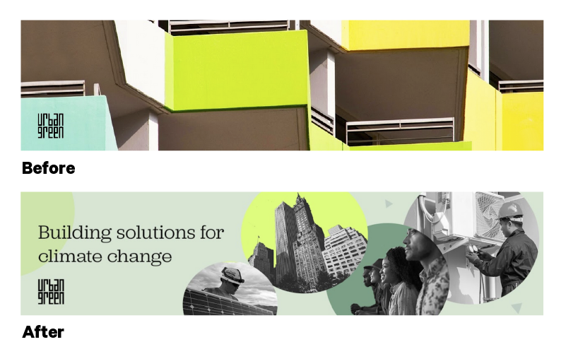
Refinement 5: Have fun with creative direction
If you want to get even more creative with your brand refresh, incorporating illustrations elevates your brand and makes a bold statement. Illustrations serve as an extension of your brand identity; from shapes to icons, they can carry specific functions for your brand. Most importantly, they show rather than tell, making it easy for you to provide audiences with a story in a more streamlined, cohesive, and compelling way. They add depth to your communications/flavor to your brand, and humanize your organization by bringing your personality to life. Furthermore, using illustrations on your website or social media can elevate how audiences engage with your brand, creating a unique experience. For example, illustrations and icons can be used to explain your mission, your values, your benefits, or a complex topic in an engaging and digestible way.
How should you incorporate illustrations?
Illustrations are versatile — they can be used across your communications materials, including web, social, and print — which means they are a clever way to create a unifying element across your materials, reinforcing brand perceptions and making your content much more identifiable by your audiences. Lastly, illustrations help you create a distinctive identity that sets you apart from your peers as the designs breathe new life into your brand by amplifying your unique personality, tone, and voice.
Conclusion
Refining your visuals can revive excitement for your brand. Just remember, a brand refresh is not an overhaul, so don’t overdo the changes and focus only on a few minor changes that elevate your strengths rather than large-scale shifts that more fundamentally change your brand identity. And once you’ve made those changes remember to be consistent and codify them in a brand guide so everyone at your organization is creating materials that accurately represent your organization.
Not sure if your organization needs a refinement or refresh… or where to get started? Reach out to us and we’re happy to explore what might be right for you.