Make your logo stand out from the pack


Back in April, Sandy Zimmerman and Sarah Durham had a conversation on our podcast about whether your organization’s logo should stand out or fit in with the pack. They talked about how to leverage existing tropes or universal visual symbols as quick shorthands to communicate what an organization does, and also as an opportunity to memorably position and echo a nonprofit’s brand personality.
In this post, we’ve selected some effective examples in five categories as a companion visual showcase to expand on that initial conversation, using a mix of logos created by Big Duck and others that we admire which push clichés in an original and memorable new direction.
Social services
Service organizations often leverage visuals of hands, hearts, and people to signal warmth and humanity. Hands are often held in a cupped gesture or with open palms. The logo Big Duck designed for Family Connections makes use of this approach but creates an unexpected metaphor for community by combining hands with a tree, which adds depth and originality. Humanity & Inclusion (not created by Big Duck) merges its initials into a waving hand for a uniquely ownable gesture of humanity.

LGBTQIA+
Colors have had very strong associations in LGBTQ spheres, particularly pinks and purples as well as a full rainbow spectrum, with the rainbow flag serving as an emblem for gay pride. More recently, a light blue, pink, and white flag has gained wider recognition as representing transgender pride. When Big Duck rebranded Keshet (an organization working for the full equality of all LGBTQ Jews in Jewish life), we integrated pink in the logo to nod to their area of work, particularly because their name is not descriptive. We also used an unexpected take on the traditional rainbow palette for a unique expression.

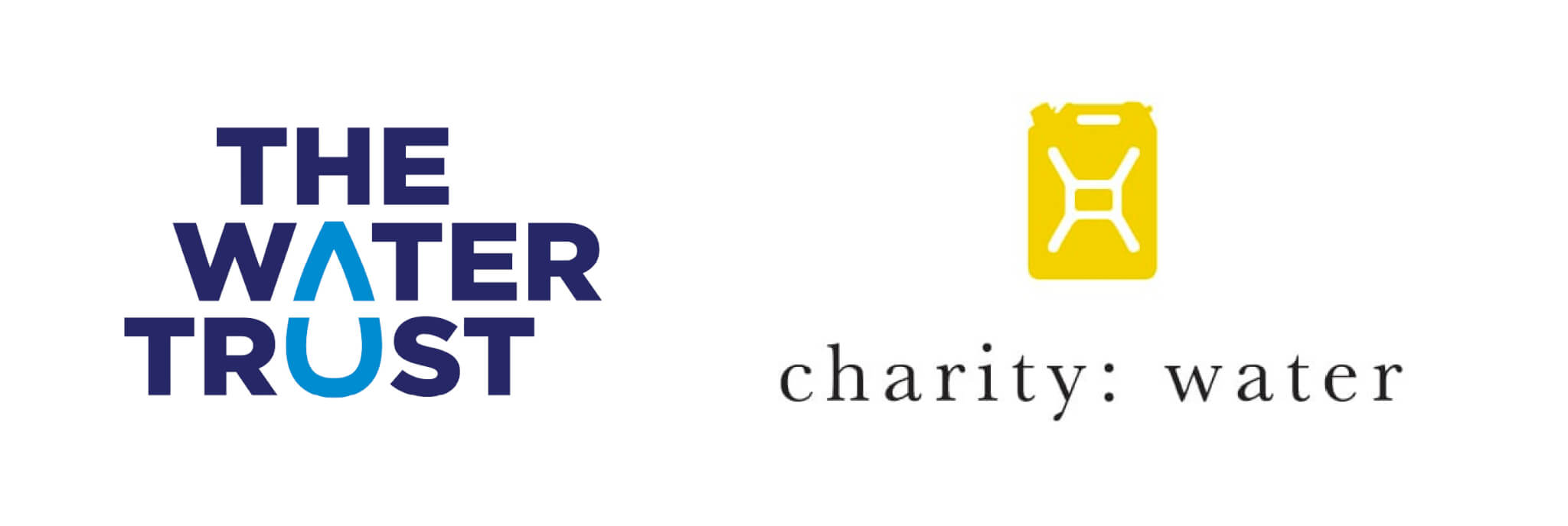
Water-focused
Organizations with a focus on water generally use water drops, bottles, and the color blue to quickly communicate their work. Charity: water stands out by using both an unexpected color and container, but still gets the idea across. In contrast, The Water Trust relies on the tried and tested but exploits a chance alignment of shapes in their name to create a memorable visual pun. (Note: these logos were not created by Big Duck)
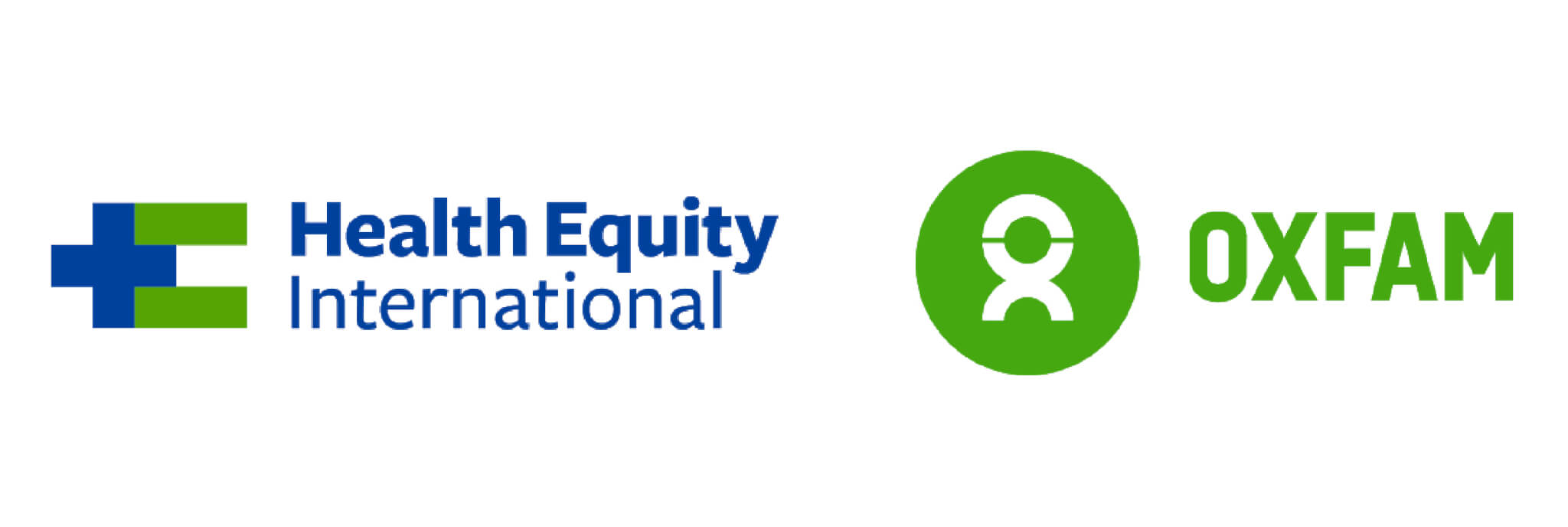
Health and international development
For Health Equity International, an organization dedicated to providing essential health services to people in Haiti, Big Duck leveraged a widely understood medical cross to quickly clue their audiences into the kind of work they do and combined it with another universal symbol– an equal sign— to mirror the two parts of the organization’s name. Oxfam’s logo (not created by Big Duck) with a universal icon of a human is cleverly crafted from the OX letters in their name, providing a unique symbol that is intrinsically recognizable and their own.
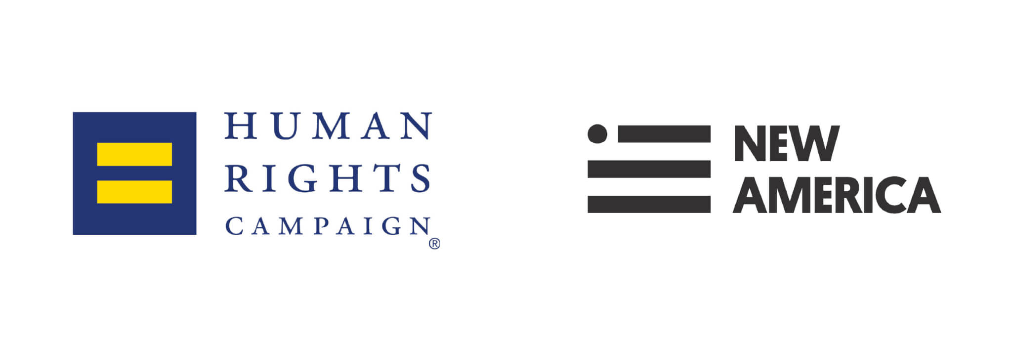
Social justice/advocacy
The equality sign, flags, scales of justice, flames, and the Statue of Liberty are all symbols social justice organizations often choose to signify their missions to create a more equitable society. The Human Rights Campaign boldly claimed the equality sign, a universal symbol, but making it recognizable as their own. New America’s logo is a flag, a conventional symbol, but cleverly uses the implied movement of a dot along stripes to tell the story of a journey to a new nation. (Note: these logos were not created by Big Duck)
Humanity & Inclusion logo created by Cossette; Water Trust logo created by Prophet; Charity: Water created by Charity: Water; Oxfam logo created by Wolff Olins; Human Rights Campaign logo created by Stone Yamashita; New America logo created by Simple.Honest.Work./The McQuades