Keeping a rebrand fresh: An interview with Access Justice Brooklyn

In the almost three years since Access Justice Brooklyn partnered with Big Duck to develop a new name, visual identity, messaging (and more!), we’ve watched with awe and pride at how effectively they have carried out their new brand. We know it can be challenging for nonprofits to maintain tight control over their brand identities, so we were curious to hear how they transitioned from working with a branding partner to maintaining their brand. I connected with Melissa A. Starr, Interim President & CEO of Access Justice Brooklyn, to reflect on the process of bringing their new brand to life and how they’ve managed to keep it all fresh and consistent since rolling out their new brand.
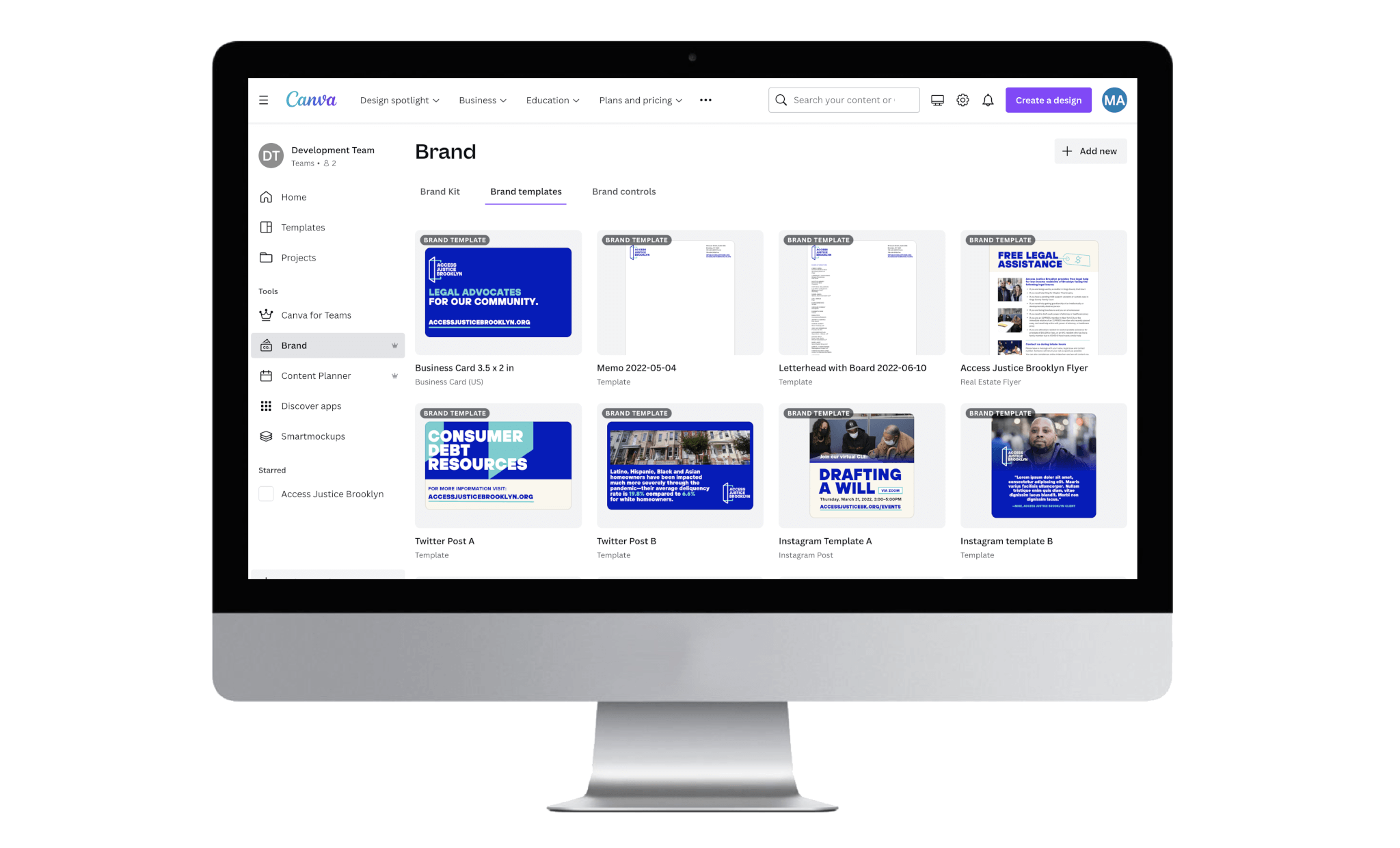
Tell us about the guidelines and Canva templates Access Justice Brooklyn and Big Duck helped set up to adapt to your new brand. Which brand templates do you use the most?
We heavily leaned on the templates provided by Big Duck during the rebrand rollout phase. The social media and flyer templates have had the most usage and were critical in our first wave of communications. The flyer template is quite versatile, serving not only as an event flyer template but as a base to create our legal and financial education resources.
The slide deck template has also been quite helpful to staff who regularly host community presentations. We have particularly enjoyed and benefited from the slide varieties, which have provided accessible options for creating visually engaging presentations for our diverse audiences.
Did you need to create any new templates?
As we lived in the brand and templates, we were able to easily adapt several social media templates to diversify our social media feeds, allow for better cohesion with our email campaigns, and develop programmatic and fundraising event invitation templates that have further elevated our brand identity.
You don’t have an in-house designer on your team. Aside from Canva, do you have any other tips for keeping things looking sharp?
Big Duck provided a selection of graphic devices we typically use on our website, across email marketing, and Access Justice Brooklyn resources. Still, without an in-house designer or communications team, graphics specifically for social media can be a challenge to produce. For this reason, we have made a conscious effort as an organization to prioritize capturing photos and brief videos at events we host or attend throughout the year. This allows us to highlight our presence in the community, the Brooklynites we serve, and our programmatic and philanthropic partners.
Additionally, we create an annual video highlighting Access Justice Brooklyn’s services that is produced by a professional cinematographer and premieres at our annual gala. We then maximize every opportunity to pull images and video clips from these videos for various campaigns throughout the year.
We occasionally use stock photography and access photo libraries to have a broader range of images to select from. However, our brand identity guides our selection approach, and therefore, we utilize images that are identifiably Brooklyn and represent our neighbors as much as possible.
Have you brought on freelance designers? Are there specific projects or criteria you use to decide when you bring in outside support?
We typically hire freelance designers for more significant events such as our annual gala. This allows us to collaborate with a designer on a theme for the year and creatively tie in those elements across all our marketing, such as the invitations, the digital journal, the program, and all physical signage throughout the event. We also work with freelance designers on some of our more intricate direct mail campaigns where we do not have the in-house capacity or expertise to produce the desired design or to elevate our design concepts beyond our skill level.
It is important in this process that when bringing on a freelance designer, they produce a design that adheres to our brand identity, and therefore, sharing our brand guidelines is crucial to ensuring we, as the organization and the designer, maintain Access Justice Brooklyn at the core of every project.
Beyond the new name and logo, you also introduced a new tagline: Legal advocates for our community, new messaging, a new website, and more. Now that you’ve been living with this brand for more than two years, how has your community responded?
Our former name and logo represented our founding well; however, we did not feel it represented who the organization is today, limiting our opportunities for future growth. Our rebranding to Access Justice Brooklyn was timely, and we were thrilled by how our clients, volunteers, funders, and corporate and community partners embraced not only the visual change but also our messaging and consistency of expressed values and approach to our work.
The renaming and rebranding not only immediately modernized our identity as an accessible and impactful organization but elevated our profile throughout our community and beyond. Our new identity also opened Access Justice Brooklyn to new funding and volunteer opportunities, diversifying our revenue and pioneering pro bono model. As a result, we have since strengthened our holistic approach, offering more prevention-oriented programming, legal and financial literacy educational workshops, and expanded senior assistance services. In a relatively short timeline, these accomplishments are the best illustration of the community response.