The color of your brand
We live in an increasingly visual world, and the way people see and interact with nonprofit organizations is changing as a result. Audiences engage directly through social media and digital campaigns, skim through text, and view everything on smaller, mobile screens. The visuals an organization utilizes can have a huge impact on how effectively it connects with its audiences. And color is the biggest, most obvious visual tool at a nonprofit’s disposal.
Here are a few ways to make use of color throughout your visual identity and some general best practices for using color wisely.
Let’s start with strategy. When we’re rebranding an organization, there are two major considerations we keep in mind when recommending a color palette: the “universal” associations of specific colors and what colors the peer landscape for an organization’s sector is currently using. While color associations are cultural, with our target audiences in mind, we can rely on widely understood associations to support the feelings we want to convey. For example, orange is bright and optimistic; red is bold; and green is healthy and alive. We can use these emotional attachments help us convey a brand’s personality. If an organization has a brave or daring personality, they may benefit from using a red hue to express it. If they want to convey a seriousness or maturity, dark colors like blue or black can be useful. (Not sure what personality is? More on that in Farra’s helpful blog, here.)
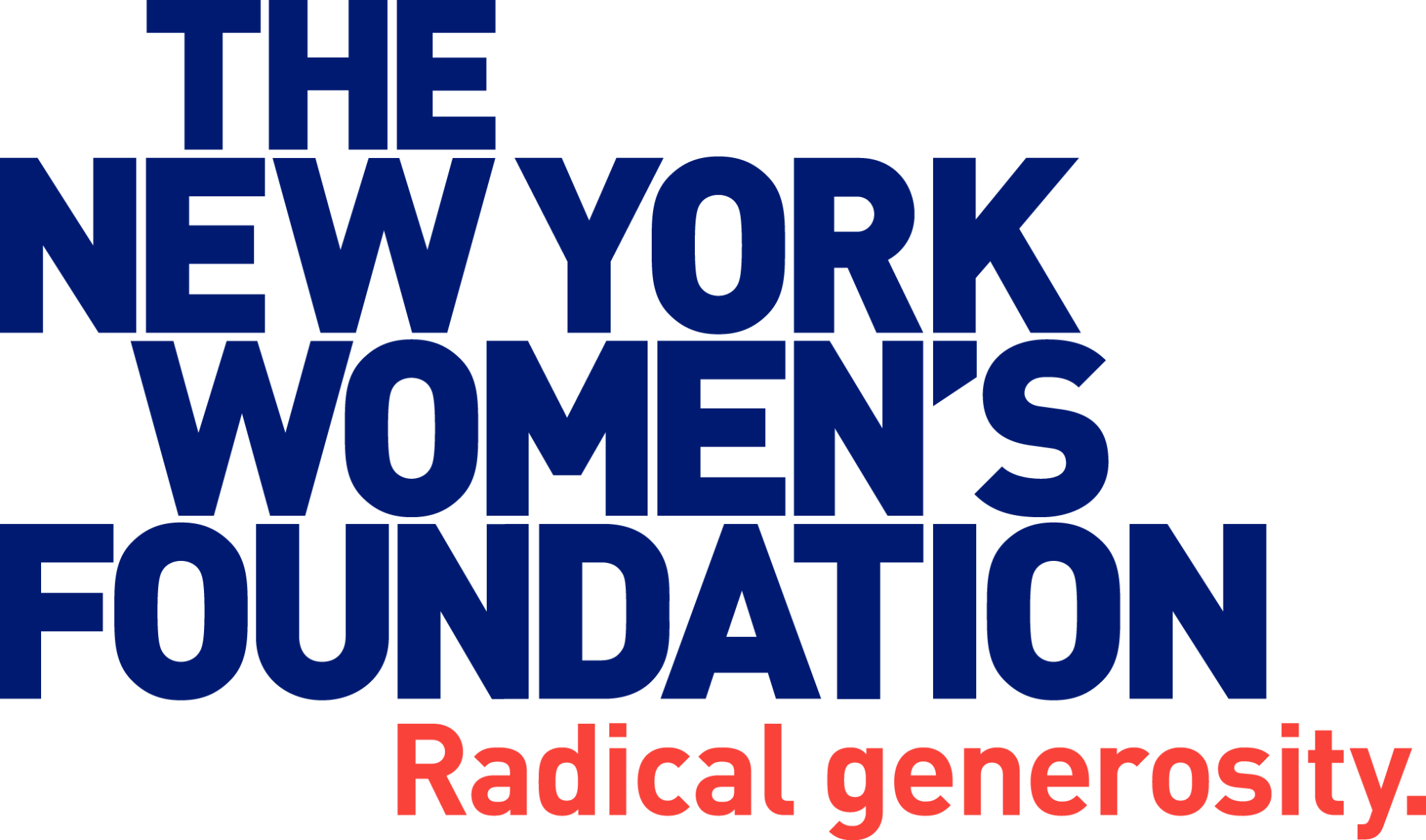
On the other hand, an organization may also choose to deliberately go against the grain and defy expectations in their space. For instance, during the process of rebranding The New York Women’s Foundation, we steered clear of colors that have been socially constructed to be associated with femininity, girls, and women such as pink or pastels in their brand. Instead, we played up the authoritative and entrepreneurial aspects of their personality by choosing a deeply hued purplish navy, accented by an energetic warm red for their tagline.

It’s also important to keep in mind the competitive and peer landscape of an organization. In some cases, it may be strategic to build on what’s already out there. For example, using green for an environmental organization might be a shortcut to communicating that kind of work. Sometimes a whole movement gets associated with a color (such as pink and breast cancer) and it is useful for individual organizations to align themselves with those existing connections. While Big Duck worked with the Atlanta Community Food Bank on their rebrand, they chose orange as the primary color in their visual palette to connect to the larger hunger movement. In other cases, this may be cause to do the exact opposite–when there is strategic grounding to do so, color can be a great way to differentiate yourself from the pack.
In addition to the color of your logo, color can be implemented in many different ways throughout your communications. Whether on your website, email templates, t-shirts and tote bags, signage in your space, or on social media, choosing one color or a limited palette will go a long way in helping your audiences pick you out of a crowd and quickly identify you. The more consistently you do that, the better chance you have of fostering a memorable image for your audiences.
If committing to a defined palette is a first step, the second, ongoing challenge is to make sure your colors are produced consistently. Whether you’re looking at a screen, printing on paper, or silk screening on a tote bag, color can be tricky! Color comes in different modes for screen and for various printing methods and getting it right takes some patience. (Check out this useful article to dig a little deeper into color models.)
Make sure to codify a universal set of standards for your different color values (RGB, CMYK, Pantone) and put them in your brand guide, where design staff and freelancers can access them easily. Because screens vary and printers vary, it’s also important to keep an eye out on all your materials and keep coming back to check against those universal standards. Designate a point-person on staff to review for consistency and keep them close by when creating new materials—because the only way to true consistency is diligence.
Whether you are in a position to choose new colors for your organization or already have them, don’t lose sight of the fact that with repeat and consistent usage across all channels, your audiences will come to identify and connect with you more quickly through the power of color.


