7 considerations for inclusive branding

Originally published on Medium, digital engagement strategist Chris Tuttle writes about the importance of inclusive branding in reaching and impacting those most effected by an organization’s mission.
The question every brand should ask itself: Who are we not reaching or serving?
The image is of a quote in white text across a blue and purple background and reads “Organizations without inclusive branding risk only advancing their mission for the least impacted by their issue.”
We cannot end homelessness if our services don’t adequately include and provide for specific segments of the population, such as black people experiencing homelessness.
We cannot ensure LGBTQ youth can grow up free from harassment if our resources and services aren’t accessible to LGBTQ youth with hearing and visual impairments.
We cannot support men with prostate cancer if 8 percent of men are colorblind and cannot access content due to the design of resources.
What each of our organizations can do is ask: “Who are we not reaching or serving today?”
I hope you’ll find these helpful in your efforts to make your organization more inclusive to all.
First, what is a brand?
The image is of a quote in white text across a blue and purple background and reads, “What is a brand? A brand is an overall experience of a constituent that distinguishes an organization from others.”
An organization’s brand includes our logo, colors, visual style, photography, videography, and much more. It’s the interactions we have with constituents, the trust we’ve built with supporters, and it’s what people think and say about us.
Branding considerations
1. Visual representation
Stock photography is known for not being very inclusive, typically demonstrating stereotypically gendered representations of “professionally” dressed people considered to be generally “attractive.” Highly stylized and staged, stock photography can also come across as inauthentic, even if representative. It can be difficult finding stock photography that is inclusive of, or better, centers, people of color, people with disabilities, LGBTQ people, people dressed in different clothing styles, with different hairstyles, and people of older or younger ages, as well as other characters often found amongst the most marginalized within our communities.
What to do:
- Invest $1-$2,000/year in creating custom stock photography with your own constituents. Hundreds of staged photos can be captured in just a couple hours, and the best of photos can often be used for up to three years before starting to feel outdated. Plan a staged photo shoot and invite constituents to participate. If possible, consider gift cards to constituents offering their image to support the organization. Don’t forget to get media releases signed by all and parent(s)/guardian(s) of those under 18 years of age.
- When stock photography is necessary, research services that focus on or include diverse audiences. Some include free services, like VICE’s Gender Spectrum Collection, PicNoi, Nappy, and Jopwell Collection: Intern Edition. and some that have free and premium services, including CreateHER, Eye for Ebony, Pixels in Colour, and Tonl.
2. Color blindness/deficiency
How our organizations utilize color and design can affect who can access that design. This is particularly true for the 9 percent of people who experience some type of color blindness — that’s 7.9 million Americans who are living with a sight impairment.
If design elements use certain colors together, such as color text on a color background or colors used in pie chart slices, it’s important to consider whether that design and information will be accessible to people with color blindness.
- Use high contrasting colors when designing, particularly when the color distinction is important to understanding the work. While not all people with a form of color blindness see exactly the same, designs with high contrasting colors will generally be more accessible.
- Use a color blindness simulator to test how your brand colors look and to test specific designs or images.
- When creating color-coded charts, ensure the data points are associated with the bar or pie slice, making color matching to legends unnecessary.
- Include considerations for people with color blindness in your organization’s StyleGuide to ensure staff and partners are considerate during design. See GLSEN’s StyleGuide at www.glsen.org/branding, for an example.
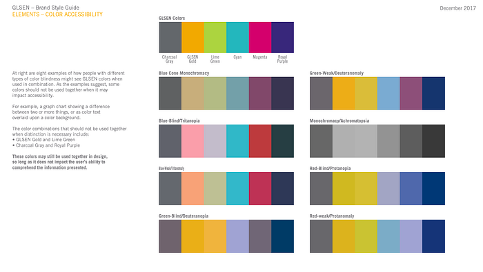
Image is of the “Color Accessibility” page of GLSEN’s Brand Style Guide, which includes GLSEN’s 6 brand colors alongside eight examples of how those colors may look for people with different types of color blindness, along with instructions on how to best use color combinations to increase accessibility.
3. Video captioning
Whether our videos live on our website, YouTube, Facebook, Instagram, Twitter, LinkedIn, or are shown at events and other physical spaces, captioning videos helps ensure people with hearing impairments can access and engage with the content.
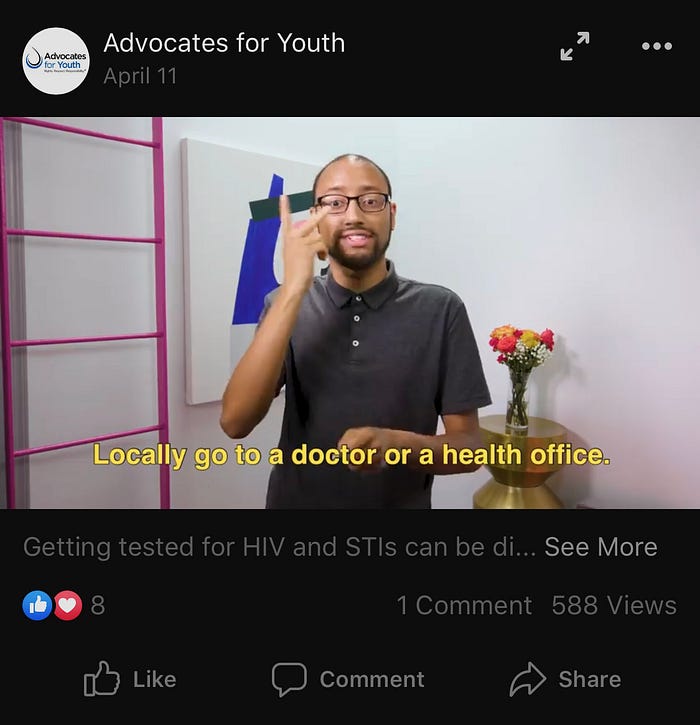
Image is screengrab of a video on Facebook of a brown-skinned person wearing glasses who is using sign language. Below the bottom third of the screen is an example of how Captioning can use text to share what the person in the video is signing, speaking, or hearing.
What to do:
- YouTube, Vimeo, Facebook, and Twitter both provide Closed Captioning(CC) functionality, allowing you to type in or upload a transcript that the user can turn on or off, hence “closed.” The captioning then appears over the bottom third of your video when enabled.
- Open Captioning — when captioning is visibly open on the video and can’t be closed — can be used for channels without CC functionality. These captions are created during video editing and appear inline with the video’s bottom third. Open Captioning not only provides hearing impaired communities with access to the content shared, but it’s also helpful for mobile users whose volume is usually muted when videos on social media channels autoplay.
4. Image descriptions
The 3.5 million (3 percent) Americans who have visual impairments may find it difficult or possible to discern details in an image. Image descriptions can provide people with visual impairments the ability to access content typically unavailable to them via images shared on our websites, email, and social channels. While an image may not be visible, or difficult to see, image descriptions can be accessed by Screen Readers for the hearing.
Image Descriptions are already considered necessary for website accessibility, despite most nonprofits still not utilizing them. We need to change this. Make it a habit, or better, a requirement.
On social media, where visual content outperforms plain text and is often a post’s focus, such as on Instagram, it’s particularly important we consider how accessible each post is to our audiences.
What to do:
Exercise: Take one minute and look at your Instagram account’s last 10 posts. Try to ignore the images and just read the text posted with each. Or have someone share with you just their post copy and no images. Do your posts still resonate or is there missing context the visual provides?
Two mobile phone screenshots are shown in this image. The first shows the Instagram Advanced Settings screen where image descriptions can be provided. The second screenshot shows an Instagram post from Helen Keller International, as an example of how to share an Image Description in the copy of the image’s post.
- Learn how to write alt text and image descriptions.
- Implement organizational standards that all images, whether on websites, email, or in social media, should include concise descriptive text.
- Configure Content Management Systems (WordPress, Drupal, custom websites, etc.) to make the Image Description a required field for all images.
- If working in an organization with distributed communications access to the organization’s web, email, or social channels, provide sample Image Descriptions to help staff create a concise descriptive copy.
- On Instagram, use the Description Text field found under Advanced Settings while posting an image to create.
- On social channels without built-in Image Description fields, add the description to the post copy — often done after the post copy and before the hashtags, as seen in this example.
5. Brand diversity
Many brands are coming to understand that the exact same look and messaging won’t work for every audience. For nonprofits, this is crucial. We cannot complete our missions for all of our communities without understanding the specific communities and experiences each of us holds.
What to do:
While our experiences and identities vary, we can find commonality and community amongst our shared values and goals. Further, we can make our brands more accessible — and center inclusivity as a brand value — by finding ways to allow our brand to be diversified while maintaining overarching brand consistency across messaging and visual design.
- One consideration demonstrated in GLSEN’s StyleGuide is the use of differently colored business cards from which staff could choose from when hired, to best match their audience or personality.
- Examine how our organization’s messaging can be diversified to help folks use what’s most effective for them and the audience they’re communicating with. For example, the statements, “I believe in safe schools for LGBTQ youth” and “I believe in safe schools for all students, regardless of sexual orientation, gender identity, and/or gender expression” both share the same values, yet will resonate differently to different audiences. How can you create variations to standard messaging that is most effective with the communities you’re not reaching.
- Consider how design can utilize our primary colors and a palette of secondary brand colors strategically by using secondary colors differently for content shared across different audiences. Certain colors or color combinations may appeal more to different audiences. Likewise, design styles using the same primary brand colors can be implemented slightly different on communications to different audiences.
- For photography-focused efforts, use multiple images in the concept that represent a diversity of constituents — either rotating use on emails/fliers/banner ads/etc. or shared as a social media carousel post or album of images.
6. Deeper audience profiles
Many organizations — and certainly any marketing agencies worked with — are creating audience profiles of our primary audience segments. They will often include a picture or artwork depicting “the average donor” or constituent group, such as parent, student, income level, race, gender, etc., along with a summary of research and assumptions about this audience segment.
What to do:
While such segmentation is incredibly important for understanding audience profiles, it also can generalize our primary audiences to the most common currently engaged. For organizations that have historically struggled to serve the most underserved amongst our communities, this topline profiling can reinforce existing disparities in access to programs and services.
7. Tech accessibility
While this still holds true, it’s also ensuring our websites are mobile-responsive for people on the go and those who may not have access, or safe access, to personal computers to easily connect.
We often think tech accessibility is about whether people without Internet-accessible phones or personal computers can access our websites or social channels to find information, utilize resources, or engage us for support.
It’s meeting our audiences where they’re at, such as The Trevor Project did, when recently announcing its expanded 24/7 service for text and chat messaging support for LGBTQ youth in crisis. In fact, here are 10 organizations providing crisis response via text message to make their services more accessible.
And it’s ensuring that we maintain offline access to our organization, whether printed resources, postcard marketing, newsletters, or other methods. While these may not be distributed widely to all constituents, how can we create for those in need?
And so much more…
Website accessibility; the format of resources and downloads; languages content is produced in, and the style of language used to communicate with different types of constituents; physical accessibility at events; access to all gender restrooms at events, and how staff who teach, lead programs, or otherwise train/help/support constituents are prepared to meet the different learning styles and abilities of different constituents most in need of our services.
Some folks may wonder whether event accessibility is really a branding issue, in which I offer this consideration: if people can’t get in the room to experience your brand, or even participate fully once in the room, then our brand isn’t inclusive.
Practice makes possible
Inclusive branding and inclusivity within our organizations is not a goal to reach, but a practice needing active nurturing, learning, and organizational culture change. Implement what you can, where you can, and identify what more can be done. Find ways in your organization to make habit, procedural, or a requirement the practicing of inclusivity.
Each of us can do this by constantly asking the question: “Who are we no reaching or serving today?”
What to do now?
- By no means are the considerations shared here the full list of ways we can make our brand more inclusive. Let me know what I missed and what ways you’ve seen organizations be more inclusive?
- Think about which of these inclusivity considerations, or another, you want to work toward making a habit at your organization, and create a plan to make it happen in the next 90 days.
- Identify the one thing you need to do this week to begin the process. For example: meet with my supervisor/team and discuss brand accessibility, and who we are not reaching and serving, or ask my colleagues/supervisors in what ways we’ve worked to make our brand more inclusive to date.
- Schedule one hour within the next month to craft a 90-day action plan with clear next steps needed toward implementing the inclusive branding consideration.
- Implement that 90-day plan and the inclusive branding consideration(s) and let me know how it went?