Work
JCC Manhattan

Marketing the entire organization, not just individual programs

Brands
Arts and culture
Faith-connected
Family and community

JCC Manhattan is a nexus of cultural life. But in 2014 was without a system to unify and market hundreds of classes, programs, and events, they struggled to move participants beyond one-off transactions toward a deeper understanding of, and relationship with, the overall organization.

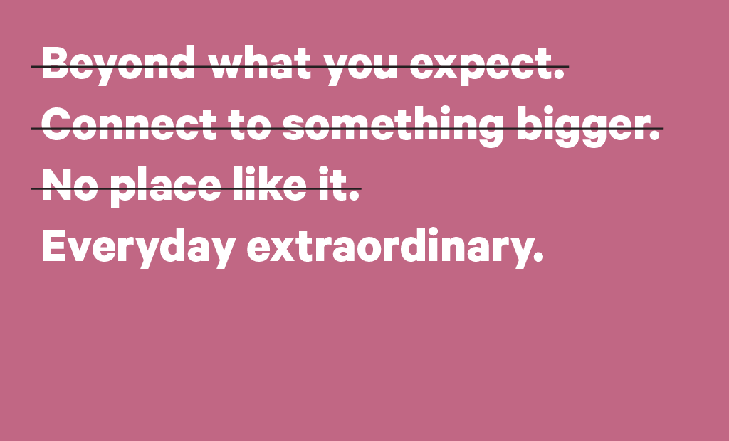
JCC Manhattan yearned to speak with one voice across all programs.

When a department or program needed a new brochure, JCC Manhattan’s communications staff would make it from scratch, sometimes creating a new logo, too. Members and visitors experienced a disparate array of materials and messages that didn’t clearly add up to a bigger picture about JCC Manhattan’s value—making the case for giving beyond membership more difficult.

Time to connect the dots.

It was clear that JCC Manhattan’s in-house communications team needed a simple and flexible way to connect all of its programs and help bring the JCC’s overarching value to the forefront. Programming staff also needed to buy in to marketing materials that felt more aligned with other collateral. It was time to get everyone on the same page.

Sending consistent messages and marketing unique programs

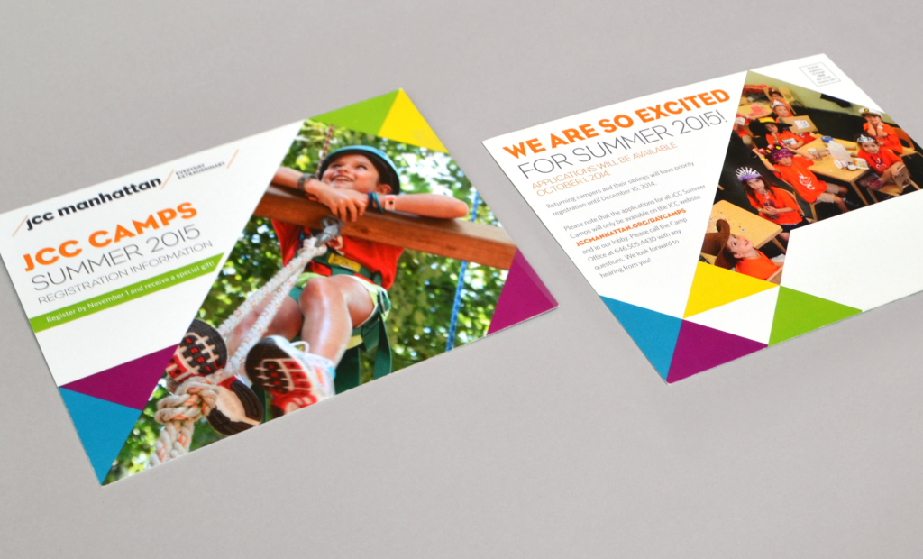
Big Duck created a simple visual system and brand architecture strategy that could apply easily to every component of the JCC’s communications—allowing programs to maintain some individuality while reinforcing the new JCC brand as a whole. It features a strong diagonal line, visually demonstrating how programs connect to centers and the JCC overall, and emphasizing forward momentum and transformation.

JCC Manhattan tagline
Their new tagline expresses the quality of their work and the transformative value delivered in everyday experiences—from art classes to the health club.
JCC Manhattan templates
We created templates for print and digital assets, working closely with the JCC team to ensure they’d have the right mix of consistency and flexibility to use day-to-day.
JCC Manhattan logo
The JCC’s new logo is a simple wordmark with a visionary touch. The diagonals serve as a visual device, allowing space for their tagline, centers, programs, and events.

Longer, stronger, relationships

When programs take on identities of their own, audiences can miss the mission behind it all. By prioritizing JCC Manhattan’s master brand in all of its initiatives, the JCC’s participants and members immediately recognize and form a connection to the organization’s larger identity.

The results

JCC Manhattan spends half the time and makes twice the impact. With a cohesive brand system and guidelines in place, JCC Manhattan’s in-house communications team now works proactively and more efficiently. Most importantly, no matter the entry point—a program, class, event, or a swim in the pool—new members connect their own transformative experience to JCC Manhattan, making relationship-building and fundraising easier than before.


Not only does our new visual system make it easier for staff to produce marketing materials for all of our programs, our current members, clients, and volunteers now see the JCC—and the experiences we provide—as a whole. We are a true community center.

— Peter Hines, Senior Director of Creative Services, JCC Manhattan

Are your programs telling your organization’s story well? Let’s talk.